Are you one of “those people” who admires the happy and abundant flourishes of color in the shelter magazines but when it comes to your own home, you have a hard time getting beyond beige? If that describes you, you are definitely not alone. In fact, color consultation is a major reason why many homeowners consult with an interior designer.

Designers are not only trained on how to use color within the space (what shades work best for walls and what shades work best for throw pillows), but also how to combine colors and patterns for a beautiful and stylish interior. Designers also stay up to date on current and future color trends and can be a gold mine of information as to “what’s hot, and what’s not!”

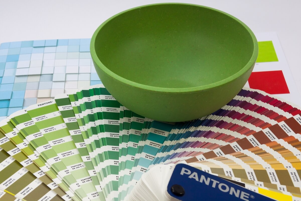
One of my favorite exercises for a new client is to have them tear out pages from magazines where a color or color combination appeals to them. Shelter magazines work well for this, but fashion magazines work well too. It may be a particular color of a gem stone or a color in the background of an advertisement. Any color that is appealing, tear it out. It’s very revealing to take those magazine tears and group them according to color or color family. We start to get a very clear look at the colors that are most appealing to that individual, and can then be worked into the overall design of a space.
I also advise clients not to worry about trendy colors. It’s good to know – but they don’t need to be your guiding influence. We can work those colors in as accents if needed.
Just because your favorite color doesn’t show up on the “hot” list, doesn’t mean you can’t use it. Your kitchen designer will encourage you to use the colors that appeal to you and have special meaning for YOU. That’s what makes your house feel like a home. Your designer will most likely make suggestions for a color combination that uses your favorite color in combination with a punchy, popular color.
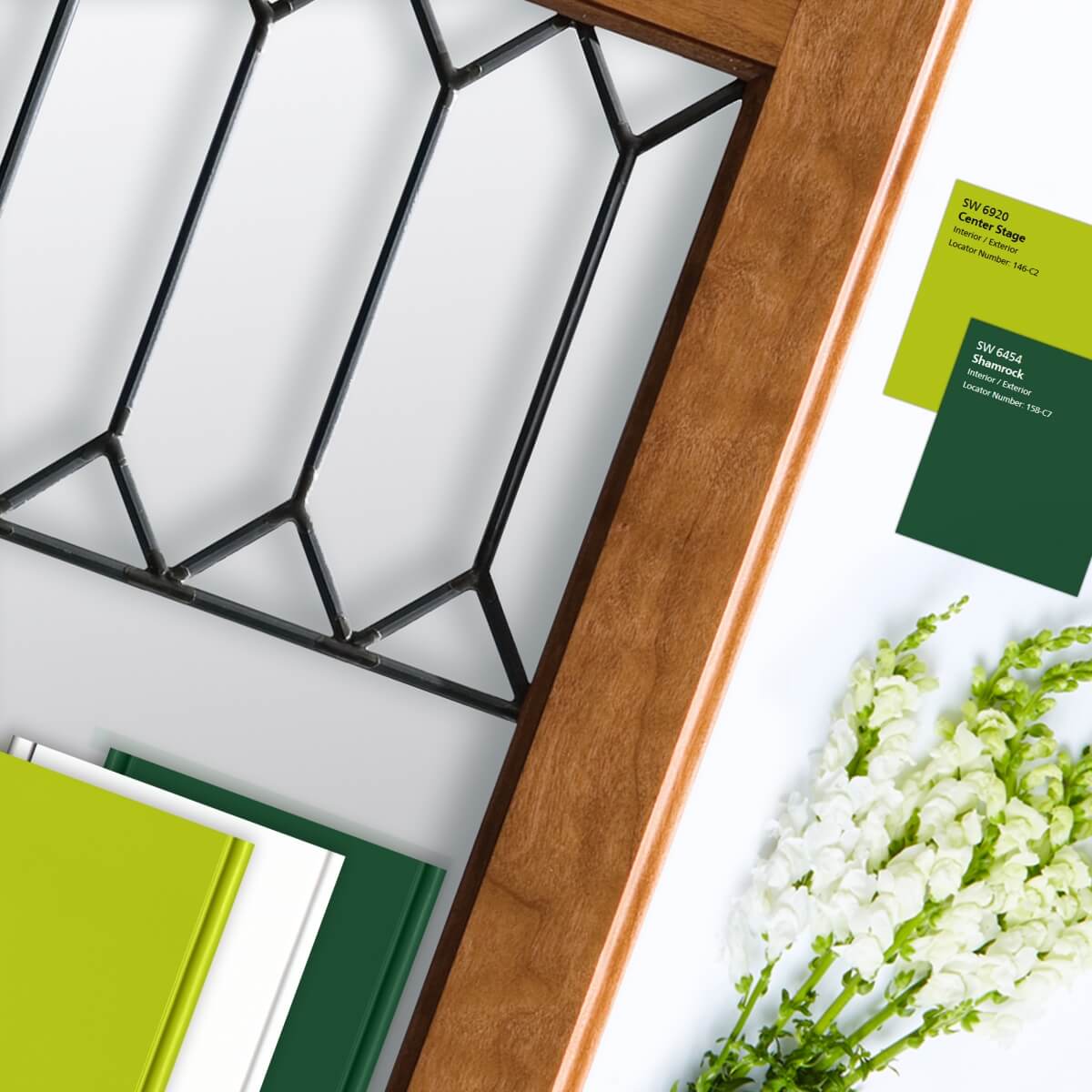
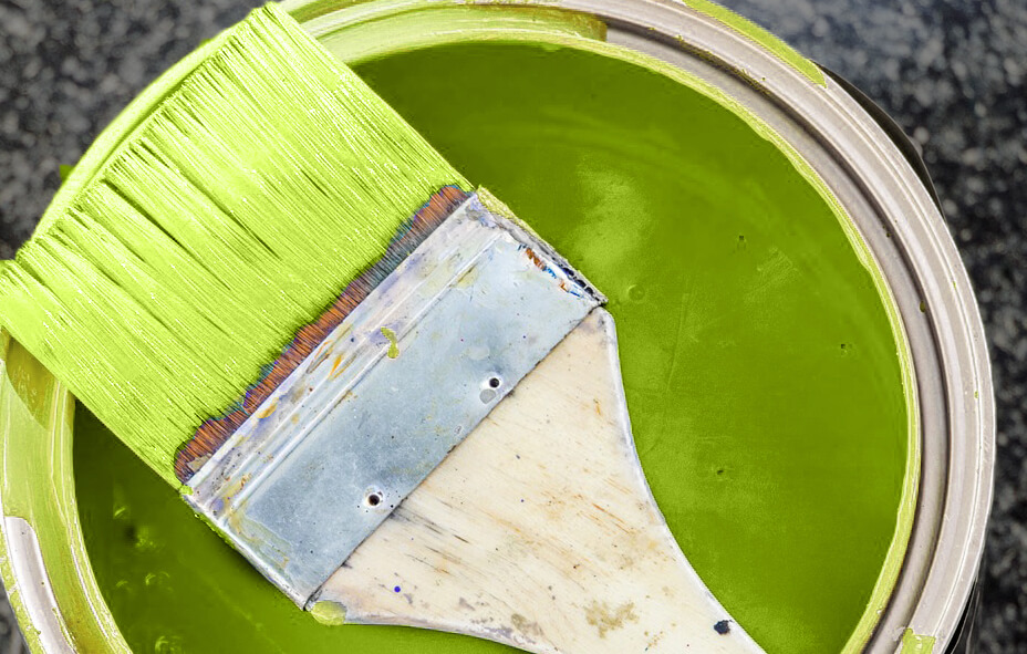
Dura Supreme Cabinetry Mood Board featuring the Leaded Glass Door #52 and paint samples in “White” combined with Personal Paint Match “Center Stage” and “Shamrock”.
One of my favorite examples of a homeowner’s color scheme that was successfully worked into a kitchen makeover is this photo of a Dura Supreme kitchen designed by Barbra Bright of Barbra Bright Design in San Francisco, CA. This kitchen is a perfect example of how a customer’s favorite color can be worked into the design to create an incredibly personal and unique look. Everyone that sees this kitchen says “WOW!” and notice how the bright green paint is only used on a few doors and drawer fronts that could be changed if the homeowner eventually wanted a different look.
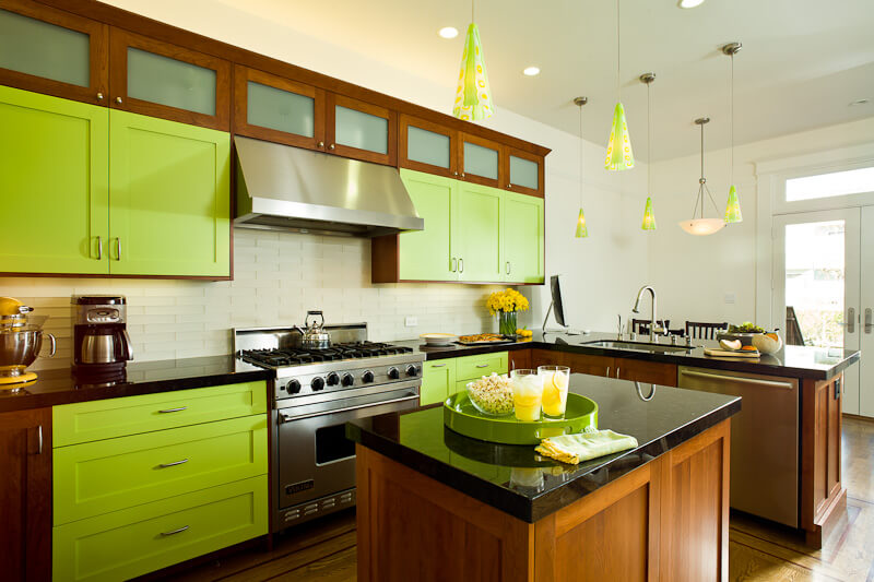
Dura Supreme cherry cabinetry with accent doors of custom green paint. Design by Barbra Bright of Barbra Bright Design, California.
Barbra’s client, Evelyn, came to her with a photo from a European magazine with an extravagant use of bright, chartreuse green. Barbra discussed with Evelyn what she liked about the photo and it was the combination of green paint with a more traditional stained cherry wood species. “My first concern was that there was too much green paint. Was this color scheme going to be truly livable for the long run?” So Barbra suggested that they add more cherry cabinetry to ground the kitchen and to use the green paint as more of an accent. Barbra explained, “I immediately thought of Dura Supreme cabinetry because of their quality and I knew they would do a great color match!”
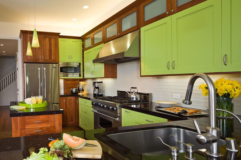
Dura Supreme cherry cabinetry with accent doors of custom green paint. Design by Barbra Bright of Barbra Bright Design, California.
Evelyn was tasked with finding the “perfect” chartreuse green paint color, one that she could live with and love for the long term. She brought in a small 2″ x 2″ paint swatch that was a screaming neon green. “I had a feeling that when she saw it painted on a larger sample, she would realize how neon and overly intense this color was. She didn’t realize that what looks good on a small chip will look much different on 42″ wide wall cabinets.”
With that in mind, Barbra went to the paint store to get a quart of Evelyn’s paint and while she was there, she selected another color that she felt would work better for the long term. She had both of these colors painted up on a large board – and Evelyn agreed with Barbra’s choice.
“We went with my choice, and then sent the sample to be color matched by Dura Supreme’s finish department. They sent us a half-door sample and the color was right the very first time! Barbra smiled in recollection and explained, “That’s when this project became the talk of the finish department at Dura Supreme Cabinetry as everyone was curious about the end result.”
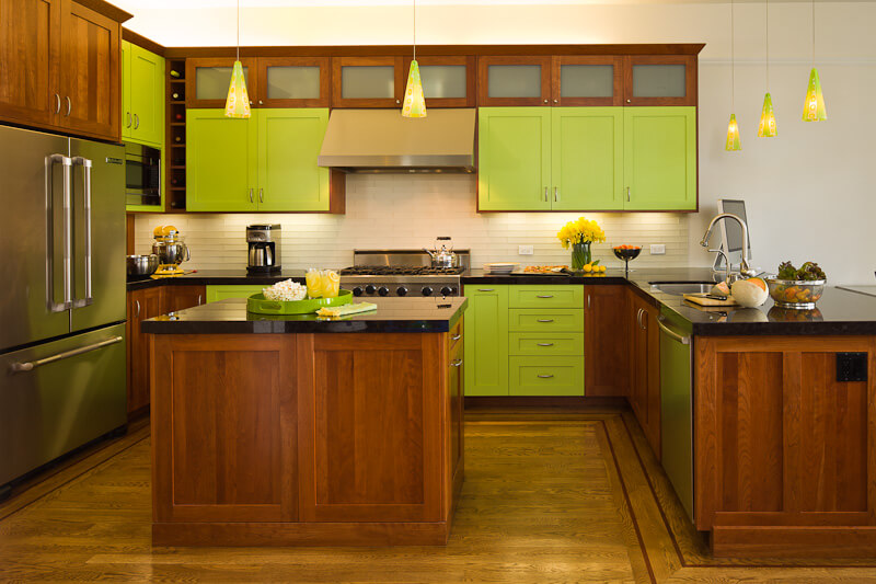
The door style is traditional but the color scheme offers a bold, fun, and modern twist! Design by Barbra Bright of Barbra Bright Design, California. Cabinets by Dura Supreme.
Barbra selected Dura Supreme’s frameless “Bria” cabinetry with a “Craftsman” door style for its contemporary styling. Cherry cabinetry with a “Harvest” stained finish was an ideal complement to the “Custom Chartreuse Green” paint. Now that this project has been completed for a few years, Evelyn still LOVES her Dura Supreme kitchen and Barbra proudly points to this project with the daring color scheme as one of her favorites!

Kitchen Design: Barbra Bright of Barbra Bright Design in San Francisco, CA
Photography: McKinney Photography
Cabinetry: Bria Cabinetry by Dura Supreme shown in Craftsmen door style in a combination of the “Harvest” stain on Cherry and a Custom Finish in a Chartreuse Green painted finish.