Making Selections

How to Choose Your Cabinetry Finishes

When making the final decisions for the finish of your cabinetry, you want to be confident that the color you select will look just the way you envision in your space. Nobody wants surprises! That’s why it’s important to know what the common deceptions of color are and how to avoid them.

A designer and a homeowner desiging a new kitchen and selecting the cabinetry door styles and finishes while sitting in a Kitchen & Bath Showroom display.
A kitchen design idea with a pretty slab style cabinet door in a gray-brown stain color on white tiles.
Selecting Colors

Mistakes To Avoid

The top 4 color selection mistakes include:

  • The Effects of Lighting
  • Misinterpreting Media
  • Not Seeing a Sample Door In-Person
  • Not Noticing Undertones
Learn about the effects of lighting and how to select colors for your home when planning a kitchen design or other interior design project. Lighting plays a huge role in how we perceive color.
A kitchen designer working with a client in a kitchen & bath showroom. The homeowner is shopping for new kitchen cabinets and making decisions on the door style and finish colors.
The in-person difference

The Effects of Lighting

Have you ever selected a beautiful paint color at the store only to discover it looks quite different once you’ve used it in your own home? Lighting plays a huge role in how we perceive color. Color has a habit of looking different under different lighting. It’s best to see a sample door in person and when possible, view it under the lighting in the actual space.

NOTE: This can be a challenge when building new or when the renovation involves windows and new light fixtures. In these cases, it’s best to view in either another room in the same home, in a space with similar lighting, or under a few different lighting conditions to understand the color variance.
The same color can look very different online, in printed materials, and with an in-person sample.
Don't be Fooled by what a color looks like in a photo. There are many sources of media to help us preview color, texture, and style. From printed brochures to photography, to online media, these are all helpful tools to guide us in an initial direction but they can also be misleading with the presentation of the colors. It’s best to see a sample in-person. Here a man holds a photo of a kitchen and compares it with the actual kitchen.
Misinterpreting media

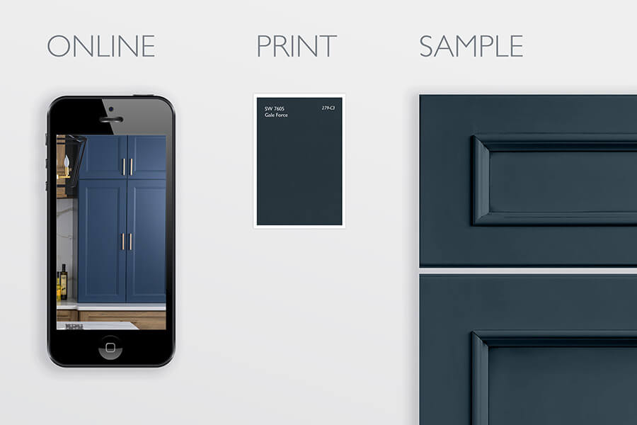
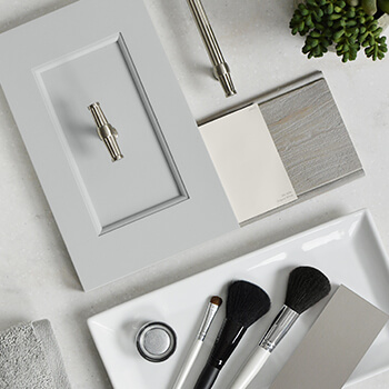
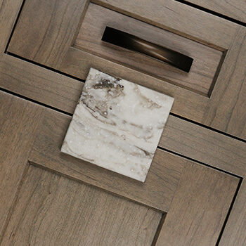
Don't be Fooled by a Photo

There are many sources of media to help us preview color, texture, and style. From printed brochures to photography, to online media, these are all helpful tools to guide us in an initial direction but they can also be misleading. There is a natural conversion of color that happens when taking a physical finish color and converting it to print, photography, screen, or other media. Although we do our best, colors will vary from one media to the next. It’s best to see a sample in-person.

Preview a cabinet color sample In-person before making your final choices. Understand the top 4 color mistakes and how to avoid them.
Viewing a sample in-person is the BEST way to accurately gauge the color of the finish you are selecting.
Here the designer has presented all the final finishes for a bathroom remodel so their client can view all the colors, finishes, and materials first-hand before purchasing.
See for yourself

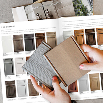
Preview a Sample In-person

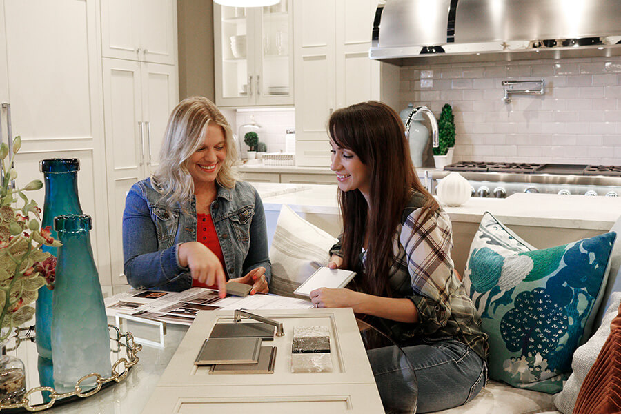
If you’ve read the above topics, you may have noticed a trend by now. Viewing a sample in-person is the BEST way to accurately gauge the color of the finish you are selecting. To be even more sure of your selection we recommend viewing in the actual space that the cabinetry will be placed if possible. 

Learn how to pair kitchen cabinet colors and finishes by understanding undertones. Color undertones are important when pulling together a truly polished design.
An undertone is an underlying color apparent in most colors. This inset cabinet door and quartz countertop sample both have a coordinating true-brown undertone to their colors.
How to pair finishes

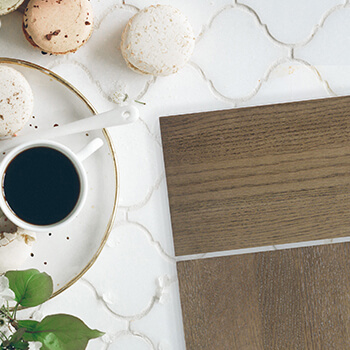
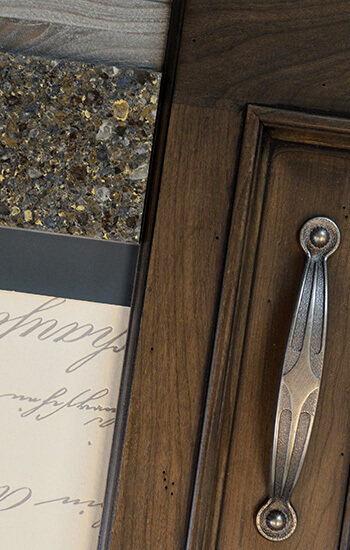
Understanding Undertones

Color undertones are important when pulling together a truly polished design.  An undertone is the underlying color apparent in most colors.  (Example: You’ve selected a gray finish, but is it a green-gray or a blue-gray?)  When you are selecting your countertop, tile backsplash, hardware, flooring, etc. your Kitchen and Bath designer will be a valuable asset in identifying material and colors that coordinate beautifully.

If you’re an authorized Dura Supreme Dealer, login here to view and save your favorites.